2022 Colors of the Year: Sherwin-Williams Evergreen Fog + 3 Other Trending Colors Announced
October 26, 2021
By Emily Webb
Each year, different paint companies choose one color from their collection to represent the tone of and guide design decisions for the following year. The companies select their color of the year by examining current events and trends and anticipating what will become popular.
Sherwin-Williams, Benjamin Moore, PPG, and Behr have all announced their colors of the year for 2022. The colors vary from company to company, but they all follow a similar theme: soothing hues inspired by nature.
The Benjamin Moore color for 2022 is also a mid-tone gray-green that is meant to invoke forest imagery, specifically “the silver-green stem of a flower.” It is the signature color of the Benjamin Moore 2022 color palette. October Mist is a slightly more pastel version of Evergreen Fog and is perfect for those who want to add a bit of color without completely abandoning the soft neutrals popular in previous years.
Nivara Xaykao, associate manager of color marketing and development, told Elle Decor, “We homed in on October Mist because it felt so fresh in the moment, but it also has a timeless quality. It’s distinct enough to make an impression of its own, but then it’s subtle enough to pair with so many other colors.”
Vevano Home designer Andrea says of the appeal of October Mist, “I think people are tired of having everything so white in their home, and this is a way they can make the home not feel so stark. This can make it feel a little more homey.”
Our Vevano Home designers view October Mist as a gentler version of Evergreen Fog. They also think October Mist will be popular with families with young children or individuals looking to update their farmhouse-style home with a new color palette. Michael recommends going with October Mist if you want to lighten up a space, and choosing Evergreen Fog instead for a room that would benefit from a darker, moodier atmosphere, like a study.
3. PPG Paints: Olive Sprig
The gray-green shade chosen by PPG Paints has a slight brown undertone, compared to the black undertone of Evergreen Fog and the white undertone of October Mist. Olive Sprig represents regrowth and resiliency, according to the company, and can work as an outdoor or indoor decor color.
PPG Paints chose the color because “homeowners, designers, architects and facility managers are craving authenticity, nature and meaningful human interaction after living in a mostly digital world.”
4. Behr: Breezeway
Where the previously listed colors all draw inspiration from plants and forest scenes, the Behr color of the year pulls from a different environment. Breezeway is a “sea glass green,” chosen because its light shade—reminiscent of a tranquil beach— brightens and invigorates any room. It’s an excellent choice for coastal-themed homes.
How to Add Green (and Other Statement Colors) to Your Home
If there’s anything we can take away from the 2022 colors of the year, it’s that green is in—and here to stay (it is evergreen, after all). For those ready to bring evergreen fog and other soothing botanical shades into their home, painting the wall is an obvious choice.
But if you’re looking for a bolder home update featuring evergreen fog, consider adding statement green cabinets to your home.
Our interior designers and custom cabinet options allow you to choose any cabinet color you want for your cabinets, including shades like evergreen fog, olive sprig, October mist, and others.
2022 Color of the Year in Action—Evergreen Fog Design Inspiration
Andrea says that she believes the driving force behind these companies choosing greens and nature-based colors is a desire to inject more warmth into a home. Even Breezeway, the coolest color of the year due to its blue undertones, is still warmer than the formerly popular grays and whites. People, in general, are ready to infuse their homes with vibrancy and passion.
Another benefit of the various greens is that they match well with other vivid colors—they serve the same purpose as a neutral tone while also adding color on their own. These trending green hues also complement materials as wide-ranging as pine wood and Venetian bronze.
Our designers put together concept boards centering on Evergreen Fog to demonstrate the versatility of the shade and how they might incorporate it into clients’ homes.
Andrea’s Kitchen
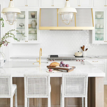
The goal for Andrea’s kitchen design concept board was to show how someone could change up their kitchen without redoing it entirely. For example, if the person has a stark white farmhouse theme and wants to warm it up, all they need to do is paint the walls or cabinets Evergreen Fog and swap out the hardware for matte black or contemporary gold finishes.
“This is a really easy way to update it with that new color while keeping the process low cost,” she said.
For this kitchen concept board, she chose a matte black Delta pull-down faucet, a matte black Delta pot filler, modern brushed gold square knobs, and modern brushed gold angular pulls. She also included black and gold pendant lights and bar stools with pewter legs.
For a more in-depth redesign, she also included a white double-basin farmhouse sink, soil brown vinyl plank flooring, and Silestone Calcutta gold countertops.
Andrea’s Office
For this concept board, Andrea considered how the increase in remote work might affect how people interact with their home office space. She said, “I wanted this concept board to feel a bit cozier. I wanted to combine darker tones with the warmer, light evergreen fog wall,” since people will be spending more time in the room in the near future.
Her goal was to create a balance between the masculine and feminine by bringing in dark furnishings to contrast with the light walls and soft art. The furnishings included a black and satin bronze multi-pendant light, black and satin brass wall sconces, a black shadow desk, and a desk chair made using smoke-top black-grain leather and stainless steel. They are balanced out by an olive Amaud rug, snow-kissed carpeting, and an art piece titled Continuous Face Graphic by Teague Studios.
Michael’s Bathroom
For this design, Michael wanted to use the Sherwin-Williams color in an unconventional way.
“I took Evergreen Fog and I put it on the vanity,” he said. “I feel like when you think of these colors, the first thing you think of is to put it on a wall—which is the easiest place to put it, of course, but I wanted to think a little bit outside of the box for just this one room.”
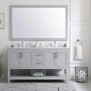
He designed the bathroom with a transitional style, combining elements of both modern and traditional styles. Along with the Evergreen Fog cabinets, he used Taj Mahal countertops, which are predominantly cream with veins of brown and gold running through. The drawer pulls are a traditional design with a nickel finish and are offset by more contemporary lighting fixtures and a sleek champagne bronze faucet.
The inclusion of gold and bronze warm up the room, and his use of hexagon floor tiles adds pattern and movement as well as a touch of mid-century modern sensibility.
Michael’s Living Room
Michael’s second Evergreen Fog concept board combines warm, organic materials with a forest-inspired color scheme to create an atmospheric living space.
“I wanted this space to feel woodsy and cozy, but I didn’t want it to feel like a cabin. Instead, I designed it with the Northern West Coast styles in mind, but with a touch of Bohemian,” he said.
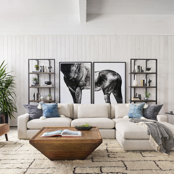
Inspired by the warm overcast forests of the Pacific Northwest, Michael opted for light, warm hardwood flooring and a cozy birch-colored sofa accented by faux-fur throw pillows. Along with these soft organic textures, the design also includes a striking mixture of metallic finishes via the coffee table’s gunmetal iron framing, antique brass side table, and gold rounded sconces.
To lighten up the space, Michael included light-colored, eye-catching pieces like the woven Ansel basket, Pyla rug, and Boho Overlaps Drawing wall art. Tying the whole design together is the accent Woodrow chair with its iron legs, Taupe coloring, and natural alder wood armrests.
Embracing a New Palette in the New Year
Each of the colors of the year discussed here can refresh your home and liven up your space with warm tones and the beauty of nature. With a multitude of gray-green tones that range in hue and intensity, these versatile colors can match any design preference. If you’re ready to update your home, our Vevano expert designers can offer professional advice about how to best use these colors to create a space that both soothes and invigorates you.

